Skoro działa i się odświeża – można zająć się wyglądem żeby przestało straszyć.
Na początku zmienię LinearLayout w ConstraintLayout i podniosę go trochę. Dodam też kolor:
This file contains hidden or bidirectional Unicode text that may be interpreted or compiled differently than what appears below. To review, open the file in an editor that reveals hidden Unicode characters.
Learn more about bidirectional Unicode characters
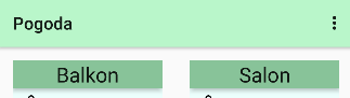
Wezmę się za nazwę pomieszczenia. Zrobię ciemniejsze tło, podniosę trochę wyżej niż cały kontener i wyśrodkuję:
This file contains hidden or bidirectional Unicode text that may be interpreted or compiled differently than what appears below. To review, open the file in an editor that reveals hidden Unicode characters.
Learn more about bidirectional Unicode characters
Każda z miar dostanie własną ikonkę prosto z https://www.freepik.com/. Jako że używam constraint layoutu to wszystko musi mieć określone względem czego ma być pozycjonowane.
This file contains hidden or bidirectional Unicode text that may be interpreted or compiled differently than what appears below. To review, open the file in an editor that reveals hidden Unicode characters.
Learn more about bidirectional Unicode characters
W uproszczeniu pracy pomoże mi guideline, do którego będę ustawiać wszystkie teksty.
This file contains hidden or bidirectional Unicode text that may be interpreted or compiled differently than what appears below. To review, open the file in an editor that reveals hidden Unicode characters.
Learn more about bidirectional Unicode characters
Ciśnienie jest dostępne tylko dla czujnika na balkonie, więc dla ułatwienia sobie życia zamknę ikonkę i tekst w grupę i ukryję je jeśli jest nullem.
This file contains hidden or bidirectional Unicode text that may be interpreted or compiled differently than what appears below. To review, open the file in an editor that reveals hidden Unicode characters.
Learn more about bidirectional Unicode characters
No i jeszcze można wyróżnić datę. Zrobić jej osobne, białe tło, wyśrodkować i zmniejszyć tekst. Ostatecznie tak wygląda aplikacja w tym momencie. Dla porównania – wersja sprzed zmian 😉